1. Size matters
Everything in Eleven is build on the base of 1rem (16px in a standard browser) It dosn't matter if its spacing between elements, size of an element or the line height, it should always be dividable with 8 as shown in the element size
| Name | pixel value | 1/2 | pixel value |
|---|---|---|---|
| 0 | 0 | 0.5 | 8 |
| 1 | 16 | 1.5 | 24 |
| 2 | 32 | 2.5 | 40 |
| 3 | 48 | 3.5 | 56 |
| 4 | 64 | 4.5 | 72 |
| 5 | 80 | 5.5 | 88 |
| 6 | 96 | 6.5 | 104 |
| 7 | 112 | 7.5 | 120 |
| 8 | 128 | 8.5 | 136 |
| 9 | 144 | 9.5 | 152 |
| 10 | 160 | 10.5 | 168 |
| 11 | 176 | 11.5 | 184 |
| 12 | 192 | 12.5 | 200 |
Instead of using device names iphone, desktop etc were gonna use small, medium, large xl
| name | em size| screensize px | | -------- |------:| ----- | ----- | small | 47.99 | > 767 | | medium | 48 - 61.99 |768 - 991 | | large | 62 - 79.99rem- | 992 - 1279,84 | | XL | 80rem + | 1280+
/* small */
@media (max-width: 47.99rem){ ... }

/* medium */
@media (min-width: 48rem) and (max-width: 61.99rem){ ... }

/* large */
@media (min-width: 62rem) and (max-width: 79.99rem){ ... }

/* xl */
@media (min-width: 82rem){ ... }
The grid system is build on blocks of 5rem wide and 1rem spacing:

Responsive grid sizes
| name | cols | col width | col space | outer space | width | img |
|---|---|---|---|---|---|---|
| small portrait | 4 | 5rem | 0.5rem | - | 22.5rem | 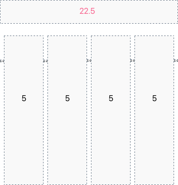 |
| small landscape | 6 | 6rem | 0.5rem | - | - | 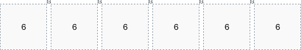 |
| medium landscape | 10 | 5rem | 1rem | 0.5rem | - | 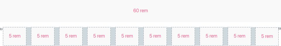 |
| medium portrait | 8 | 5rem | 1rem | 0.5rem | - | 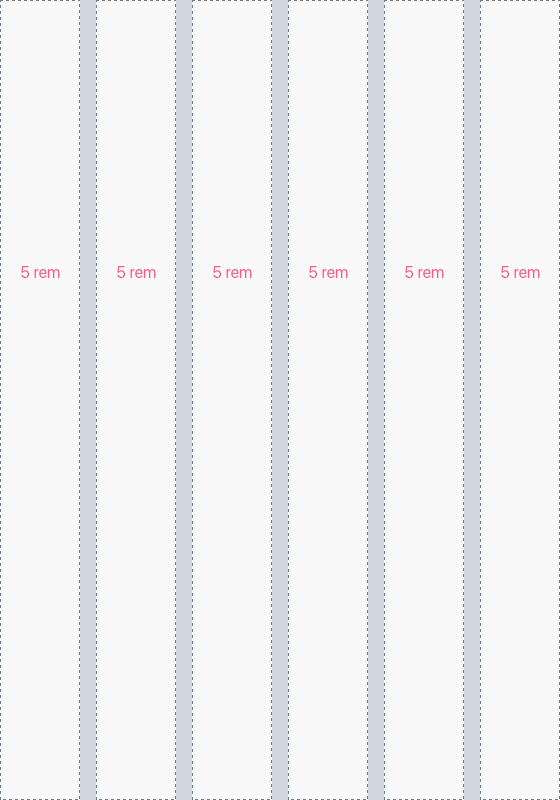 |
| Large | 12 | 5rem | 1rem | 4.5rem | - | 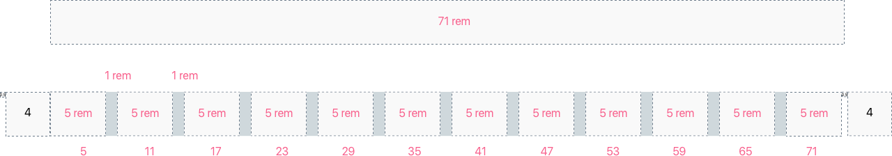 |
| g | px | px inc. padding | total rem |
|---|---|---|---|
| 1 | 80 | 96 | 6 |
| 2 | 176 | 192 | 11 |
| 3 | 272 | 272 | 17 |
| 4 | 368 | 384 | 23 |
| 5 | 464 | 480 | 29 |
| 6 | 560 | 576 | 35 |
| 7 | 656 | 672 | 41 |
| 8 | 752 | 752 | 47 |
| 9 | 848 | 848 | 53 |
| 10 | 944 | 960 | 59 |
| 11 | 1040 | 1056 | 65 |
| 12 | 1136 | - | 71 |